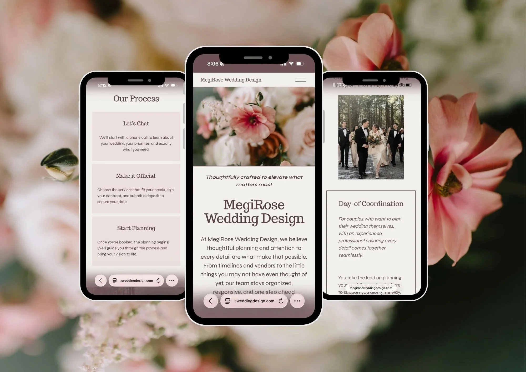
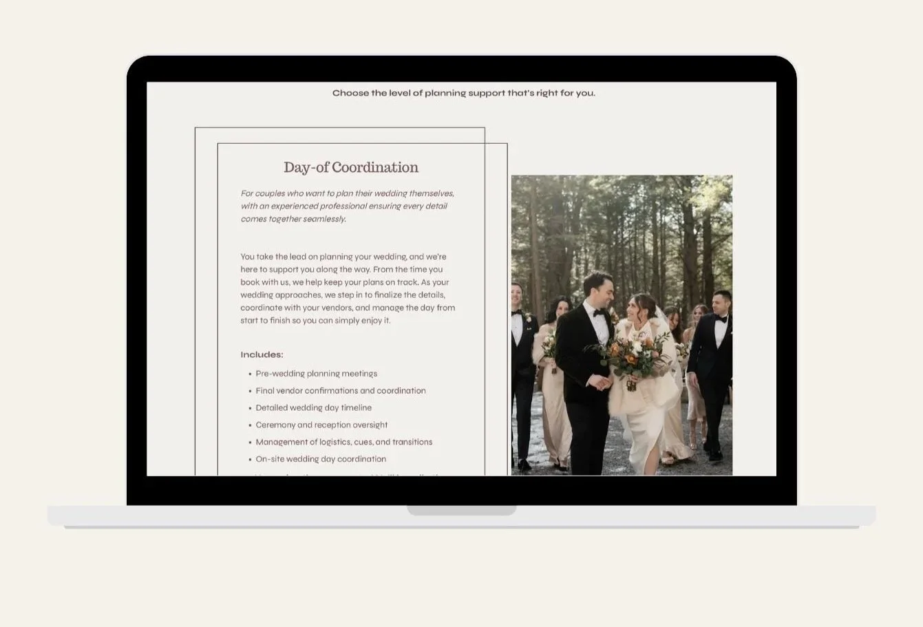
UX Case Study
Role: UX Designer / Web Designer. Year: 2026
Scope: Website audit, information architecture, content strategy, UX/UI refinement, accessibility, and SEO
Statement
MegiRose Wedding Design had a strong reputation and years of wedding planning experience. The website wasn’t fully communicating the quality, organization, and personalized service behind the brand. Important information was available, but the user journey lacked clear direction and Meghan’s experience and personality weren’t being highlighted.
The goal was to refine the existing Squarespace site into a more cohesive, user-friendly experience that clearly communicates MegiRose’s services, builds trust with potential clients, and guides couples toward taking the next step. Meghan already had a beautiful color scheme and layout. I incorporated what she already had and built upon her existing design.
Objectives
Improve the overall user experience through clear page organization, hierarchy, and navigation.
Clearly communicate MegiRose’s Day-of, Partial, and Full Wedding Planning services.
Strengthen the brand through a more cohesive visual system, typography, color palette, and images.
Highlight Meghan’s experience, credentials, team, and personal approach to build trust with future clients.
Create a polished, mobile-friendly experience that reflects the quality and professionalism of the business.
Guide potential clients toward reaching out with clear call-to-action buttons throughout the site.
Improve foundational SEO and accessibility throughout. Add meta descriptions and image alt text.
User Goals
Quickly understand the wedding planning services offered.
Easily distinguish between Day-of, Partial, and Full Wedding Planning.
Determine which level of planning support may be the right fit.
Learn about Meghan, her experience, and team.
See testimonials and credentials that build confidence and trust.
Easily find answers to common questions and contact MegiRose Wedding Design.
Business Goals
Generate more inquiries.
Better communicate Meghan’s experience, organization, and personalized approach.
Showcase MegiRose’s experience at Windham Manor while making it clear that the team works at other venues as well.
Strengthen MegiRose’s positioning as an experienced wedding planning business in the Catskills.
Create a more cohesive and recognizable visual identity across the website.
OUR PROCESS
Discover
Define
Ideate
Design
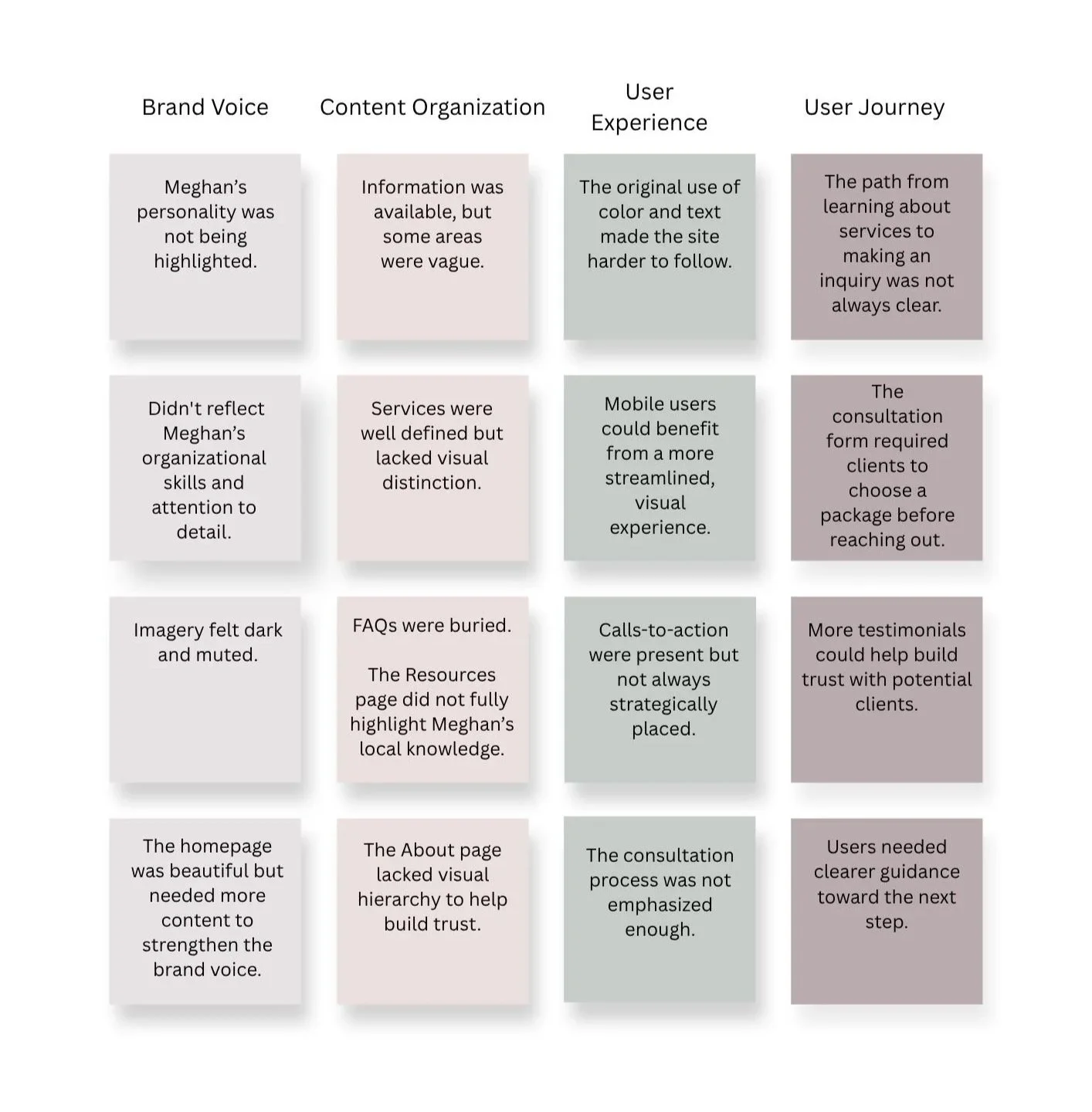
Before beginning, I conducted a page-by-page audit of the existing website to identify opportunities to improve the brand voice, content organization, user experience, and overall client journey.
Discovery & Website Audit
Navigation & Content Organization
Objective: To create a more intuitive experience that guides visitors toward scheduling a consultation.
BEFORE
Navigation was not clear.
Information has no visual hierarchy.
Trusted vendor recommendations lacked a dedicated page.
Homepage lacked information,
FAQs were buried within service content.
Calls-to-action were present but not strategically placed.
AFTER
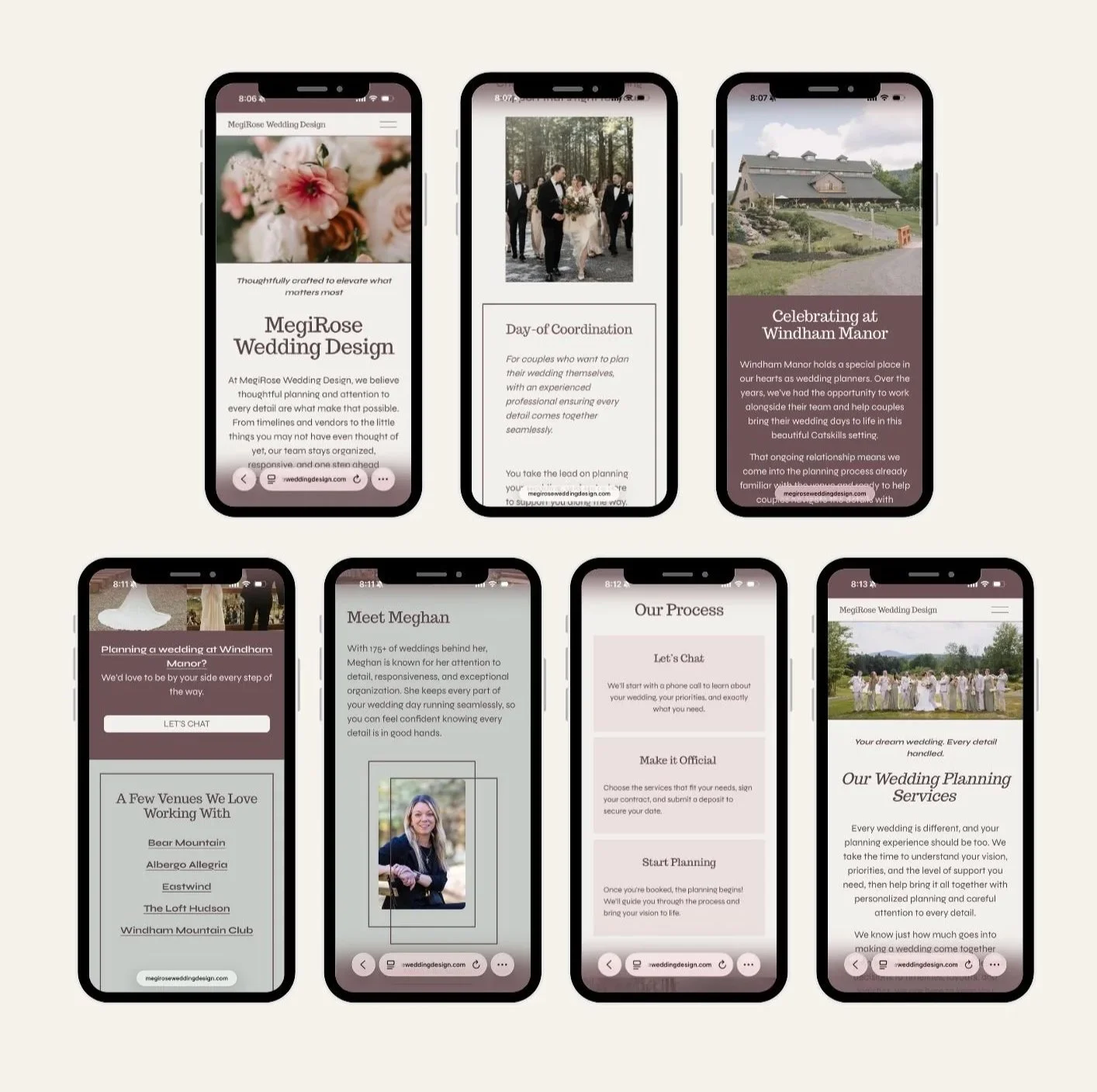
Simplified the navigation to make the site easier to explore.
Clearly defined wedding packages and services.
Moved FAQs to a dedicated page so information is easier to find.
Added a “Meet Meghan at a Glance” section to the homepage to build trust and create a more personal connection.
Added clear calls-to-action throughout the site.
Created a featured spotlight for Windham Manor, one of Megirose Wedding Design’s main venue partners.
Added photographer and venue links within images and text to give proper credit and make local resources easier to access.
Design Decisions
I designed each page while preserving Meghan’s existing content and brand foundation. I refreshed the visual style with a new accent color and more modern typography, strengthened the visual hierarchy, simplified the navigation, added new copy, and placed calls-to-action more strategically throughout the site.
Key decisions included:
Gave each planning package a clearer visual structure and updated copy.
Added new homepage sections to strengthen the brand and build trust with potential clients.
Added more testimonials throughout the site.
Moved FAQs to a dedicated page.
Highlighted Meghan’s credentials more intentionally.
Created a more cohesive visual identity through color, typography, and page layouts.
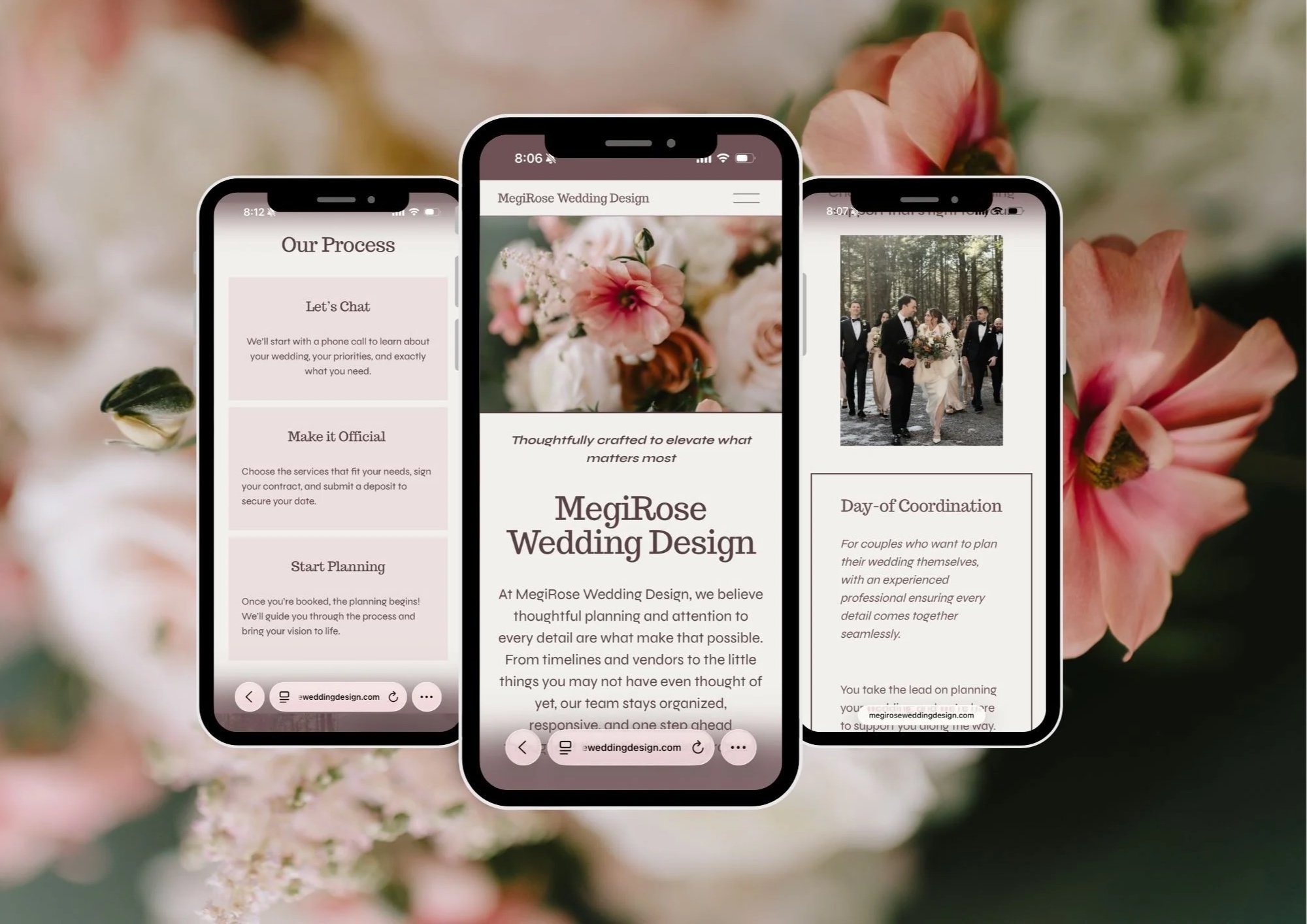
Key Design Improvements
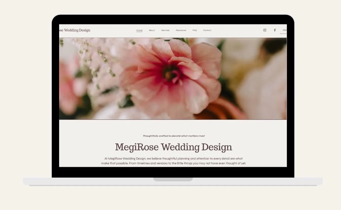
Simplified Navigation
Refined Brand Voice
Improved User Experience
Built Trust & Encouraged Inquiries
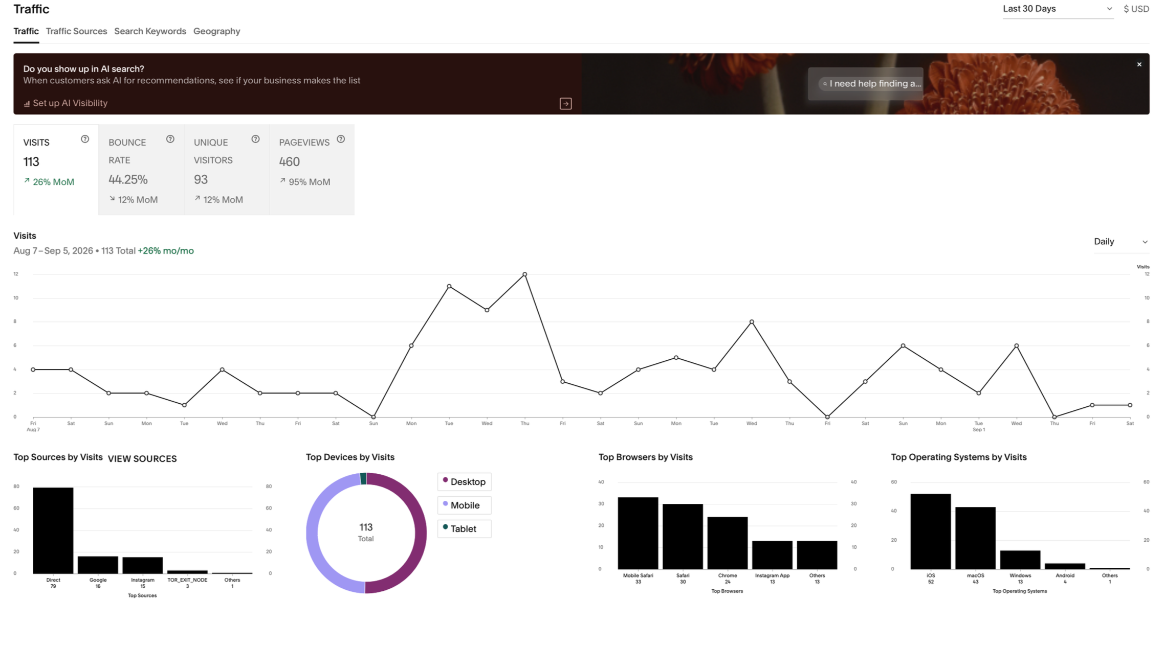
Early performance data shows encouraging improvements in how visitors are engaging with the site. Visits and unique visitors have increased, page views have nearly doubled, and bounce rate has decreased.
Current Metric Change:
Visits 113↑ 26%
Unique Visitors 93↑ 12%
Page views 460↑ 95%
Bounce Rate 44.25%↓ 12%
Reflection
This project shows how small UX changes can improve a site dramatically and create a clear user journey. Improvements to the site’s navigation, content organization, and visual hierarchy changed the way users move through and interact with the site.
Working within the existing Squarespace layout challenged me to preserve the client’s existing brand and color palette while still improving the overall experience. I really enjoyed working with Meghan and the opportunity to help her brand grow.