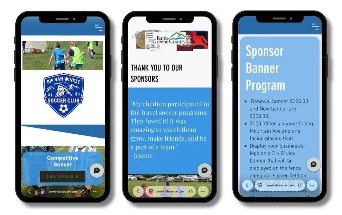
Rip Van Winkle Soccer Club
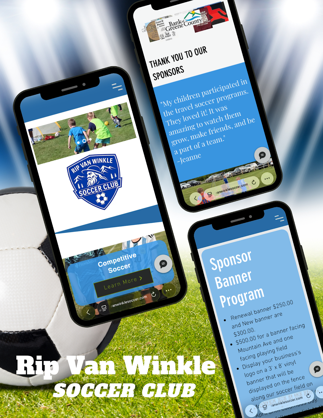
Transformed an outdated website into a modern, intuitive platform that helps parents quickly find information while increasing opportunities for registrations, volunteer involvement, and sponsorship.
My Role Year
UX/UI Designer 2026
I first came across the Rip Van Winkle Soccer Club website when I signed my children up for their summer soccer program. As a parent, I found the website difficult to navigate with outdated and repeated information.
When the club later sent an email looking for someone to help improve the website, I jumped at the opportunity and volunteered to take on the project pro bono.
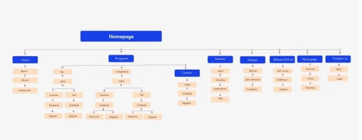
I began by evaluating the existing site from two perspectives: as a parent using the website and as a designer. From there, I reorganized the website architecture, mapped out the purpose of each page, and restructured the content around both the club’s goals and the needs of its users.
Objectives & Goals
Design a user-centered website experience that allows parents to quickly understand program offerings
Find important information
Complete registrations
Stay connected with the club through a clear, organized, and mobile-friendly interface
Business Challenges
Missed registration opportunities
Difficulty finding new volunteers
Limited visibility for sponsors
Frustrating mobile experience
Unclear path for new families
Methodologies
Competitive audit
User interviews
COMPETITIVE AUDIT
Competitor’s Strengths
Clear registration buttons
Dedicated new parent section
Updated schedules and calendars
Program comparison pages
News/announcement sections
RVWSC Opportunities
Registration links difficult to find
No onboarding for new families
Updated schedules and calendars
Outdated schedule information
Competitive programs not clearly explained
Important updates mainly on Facebook
User Interviews
Overview:
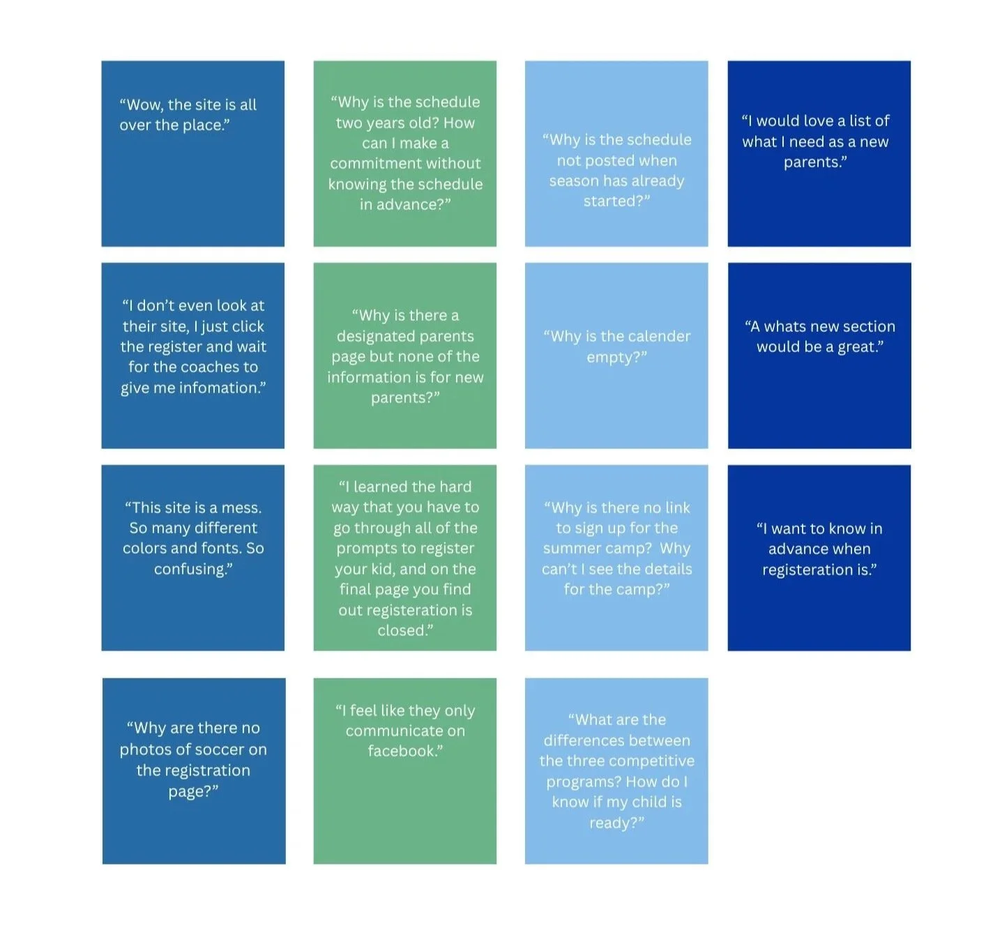
Four teenagers who are interesting in playing recreational soccer and two parents of children who play for Rip Van Winkle Soccer Club were asked to review the site. They were interviewed in person.
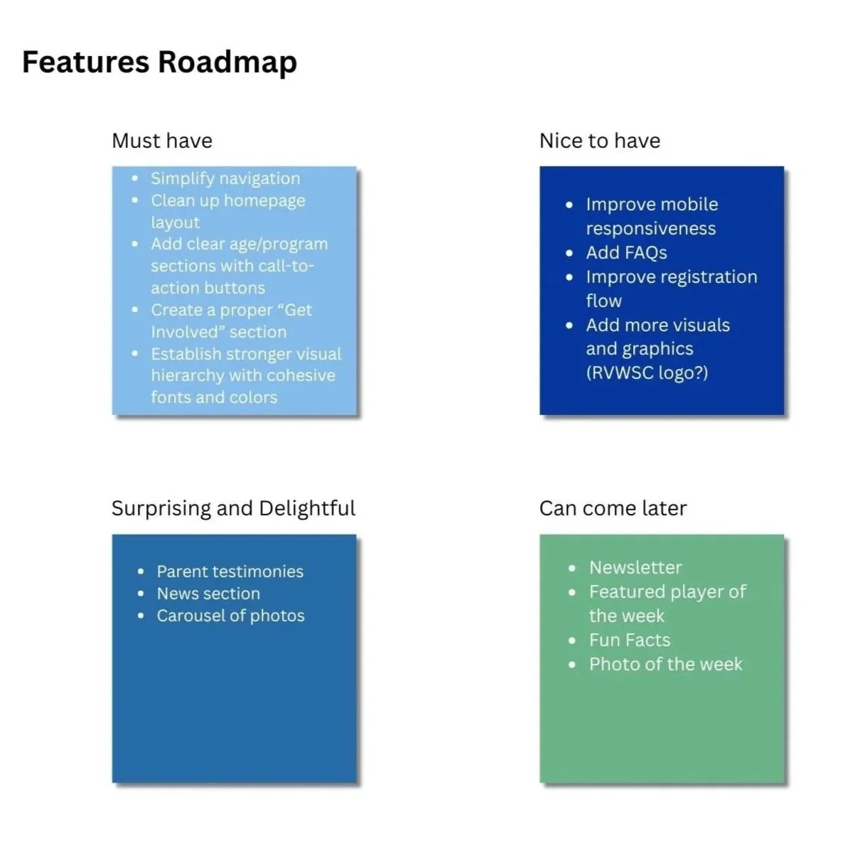
User Needs
Current Parents
Want registration dates visible months in advance
Need easier access to schedules and program updates
Prefer the website to be the primary communication source rather than Facebook
Prospective Parents
Need help understanding the differences between programs
Want a clear path to registration
Need guidance on what to expect as a new soccer family
Teen Players
Want current schedules and camp information
Need a more visually engaging experience
Want easier access to information about programs and opportunities
Wire Frames
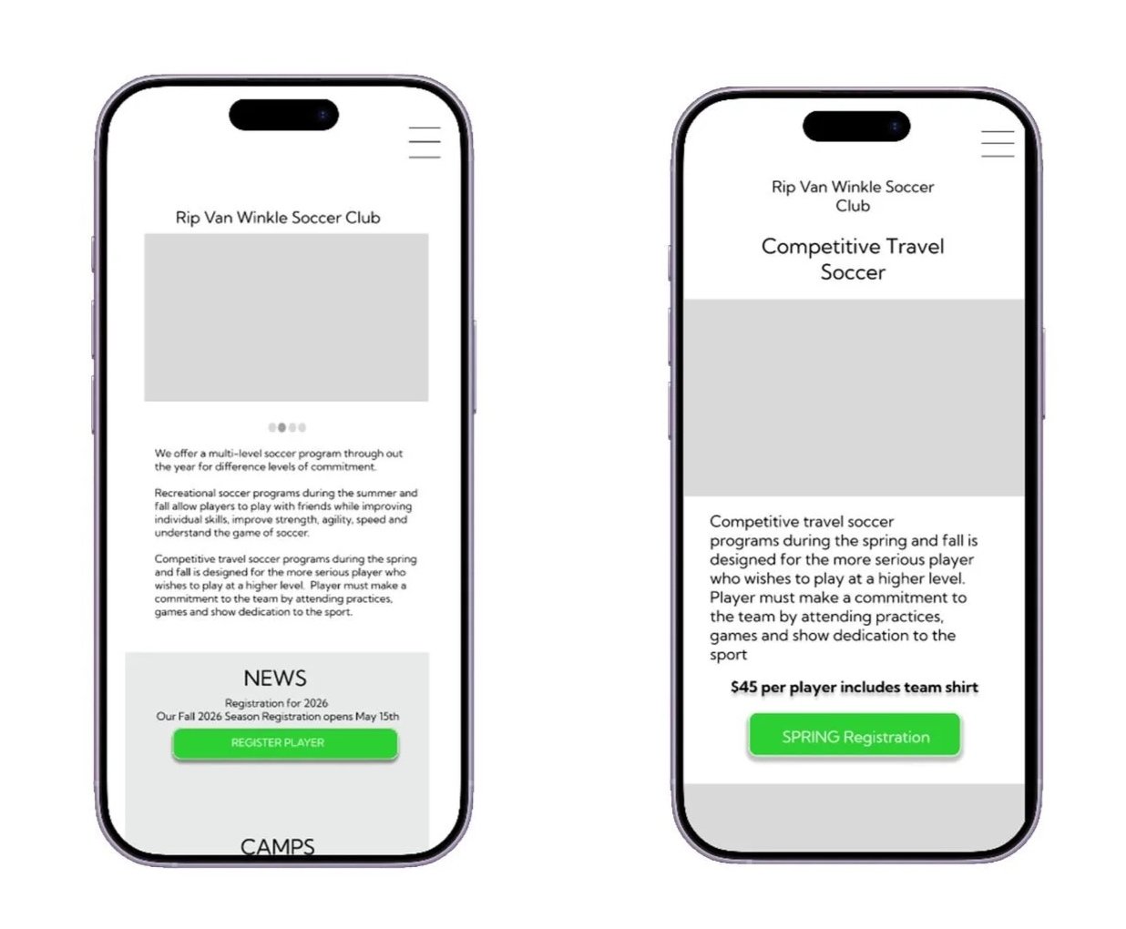
After planning the site structure, I created wireframes in Figma to test page layouts and content organization before implementation.
Final Decisions
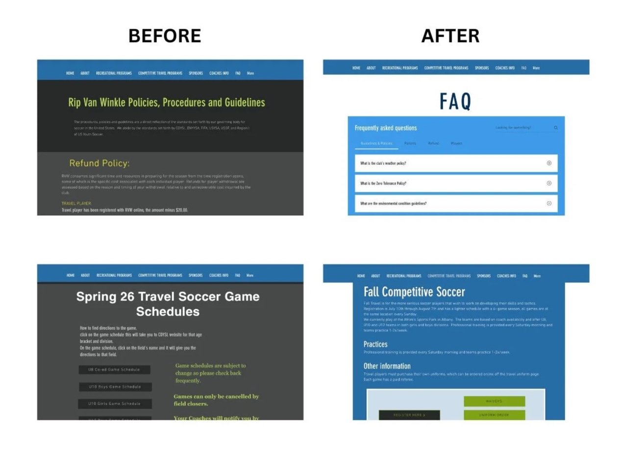
After identifying key pain points, I created wireframes in Figma to test the new design. Once the structure was finalized, I worked directly in Wix. To preserve existing content and respect previous design work, original pages were hidden rather than deleted, allowing the client to reactivate them if needed.
Reflection
Talking with users helped confirm the navigation problems I noticed when I first used the site as a parent.
Even small changes to the site structure made it much easier for families to find the information they needed.
Working within the existing Wix platform meant finding solutions that improved the experience without rebuilding everything from scratch.
Keeping much of the club’s existing content helped preserve what was already working while making the overall site feel more organized and current.
Improved the site’s basic SEO by adding alt text to images and writing meta descriptions for key pages.
I enjoyed working with RVWSC! My kids love their programs. Since it’s a nonprofit organization, and mostly volunteers it was hard to track down new images and copy. There is still some information missing from their site and some improvements that can be made. I am happy to continue working on their site and make future improvements.